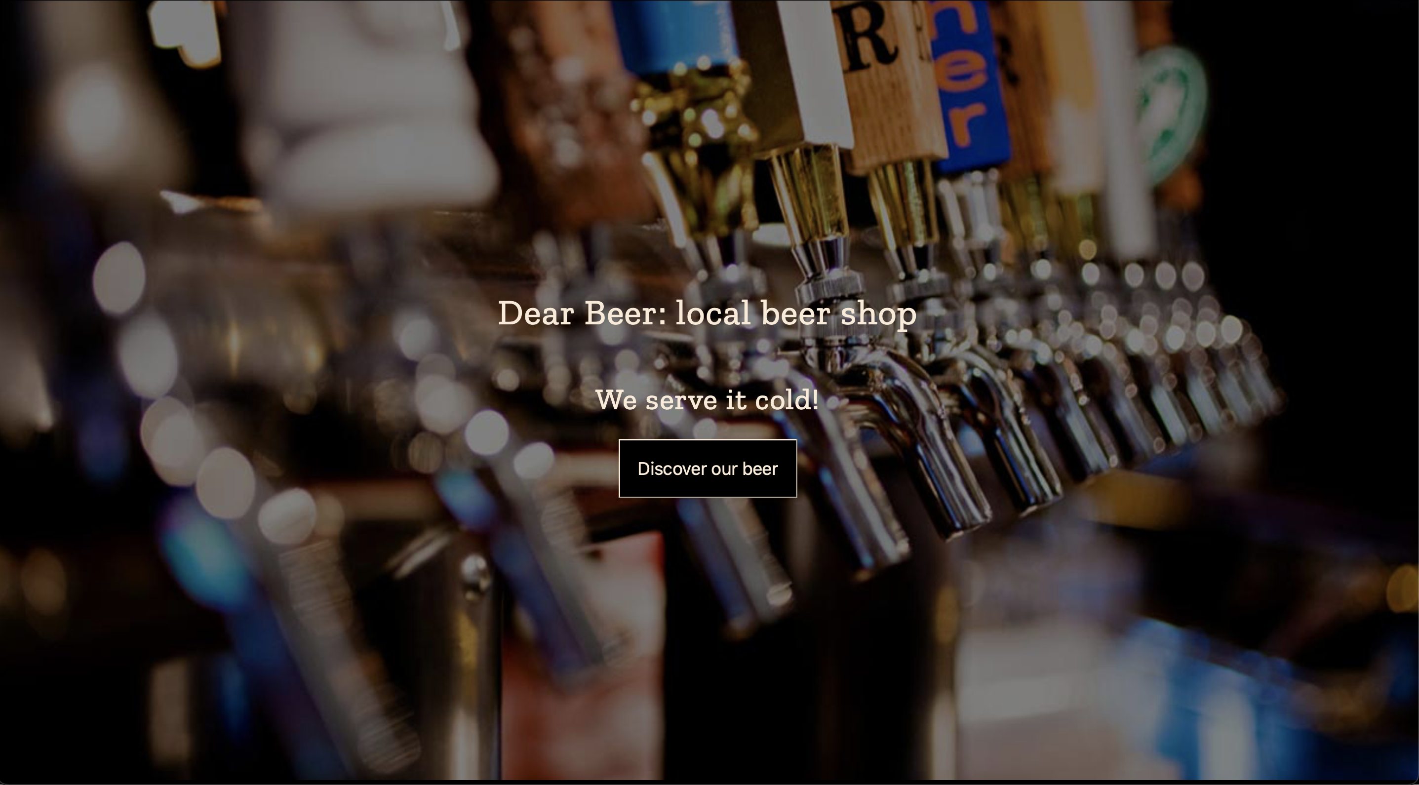
With Flexbox we can easily align any element or elements both vertically and horizontally inside a given container which might have an image background applied to achieve results as shown in the image above.
Our goal is to have a group of headings and a button positioned right in the center of both axis. We also want this container to take entire viewport both horizontally and vertically.
There is no need to use position property for that or calculate any margins or paddings to have these results.
Instead we are going to use Flexbox and image would be added as a background-image. With this approach the size of the viewport could be changed in any direction but our headings and button would be always right in the center both horizontally and vertically.
Let's see the code example.
HTML
In the HTML we want to have a container with the elements we want to center. For example:
	<section id='splash-screen'>
			<h1>Dear Beer: local beer shop</h1>
			<h2>We serve it cold!</h2>
			<button>Discover our beer</button>
	</section>
No need for the img since we are going to add the image as a background. Otherwise we will have to use position to move the elements on top of it.
CSS
In CSS we will:
- set an image as a background for the whole container (
sectionelement with idsplash-screen) - center the background image with
background-position - make sure it is resized to take all of the space with
background-sizeand prevent repeating withbackground-repeat - set the height of this section to
100vhand100vwto take the whole viewport space - make this section
flex, center items horizontally withjustify-contentand vertically withalign-items
#splash-screen {
/* setting height and width */
	min-height: 100vh;
	width: 100vw;

/* adding background image */
	background-image: url("https://barcelonacodeschool.com/files/pics/blog_posts/beer_taps.jpg");

/* assign the center of the image to be in the center of the container */
	background-position: center;

/* prevent repeating or tiling of the image */
	background-repeat: no-repeat;

/* resize image to take all the space */
	background-size: cover;

/* fix the image to prevent scrolling for some extra nice parallax effect */
	background-attachment: fixed;

/* make section flex */
	display:flex;

/* vertically center elements */
	align-items: center;

/* horizontally center elements */
	justify-content: center;

/* align element to the center within their position */
	text-align: center;

/* make text white */
	color: white;
}
Now we will have the following results:

The elements are centered both horizontally and vertically but as we can see those headings and a button now are all inline. This is how Flexbox works, by making a container flex we have all the children elements to be on the same line as default flex direction for web development is row.
It wouldn't be the problem if we only had one element inside our flex container, but for more than one we need to do extra step.
We need to make those 3 elements to be seen by Flexbox as one, hence we need to wrap them into a container.
Let's change our HTML accordingly:
<!-- section is now flex -->
	<section id='splash-screen'>
	<!-- wrap headings and button into a container -->
		<div>
			<h1>Dear Beer: local beer shop</h1>
			<h2>We serve it cold!</h2>
			<button>Discover our beer</button>
		</div>
	</section>
Et voilà! We have it!
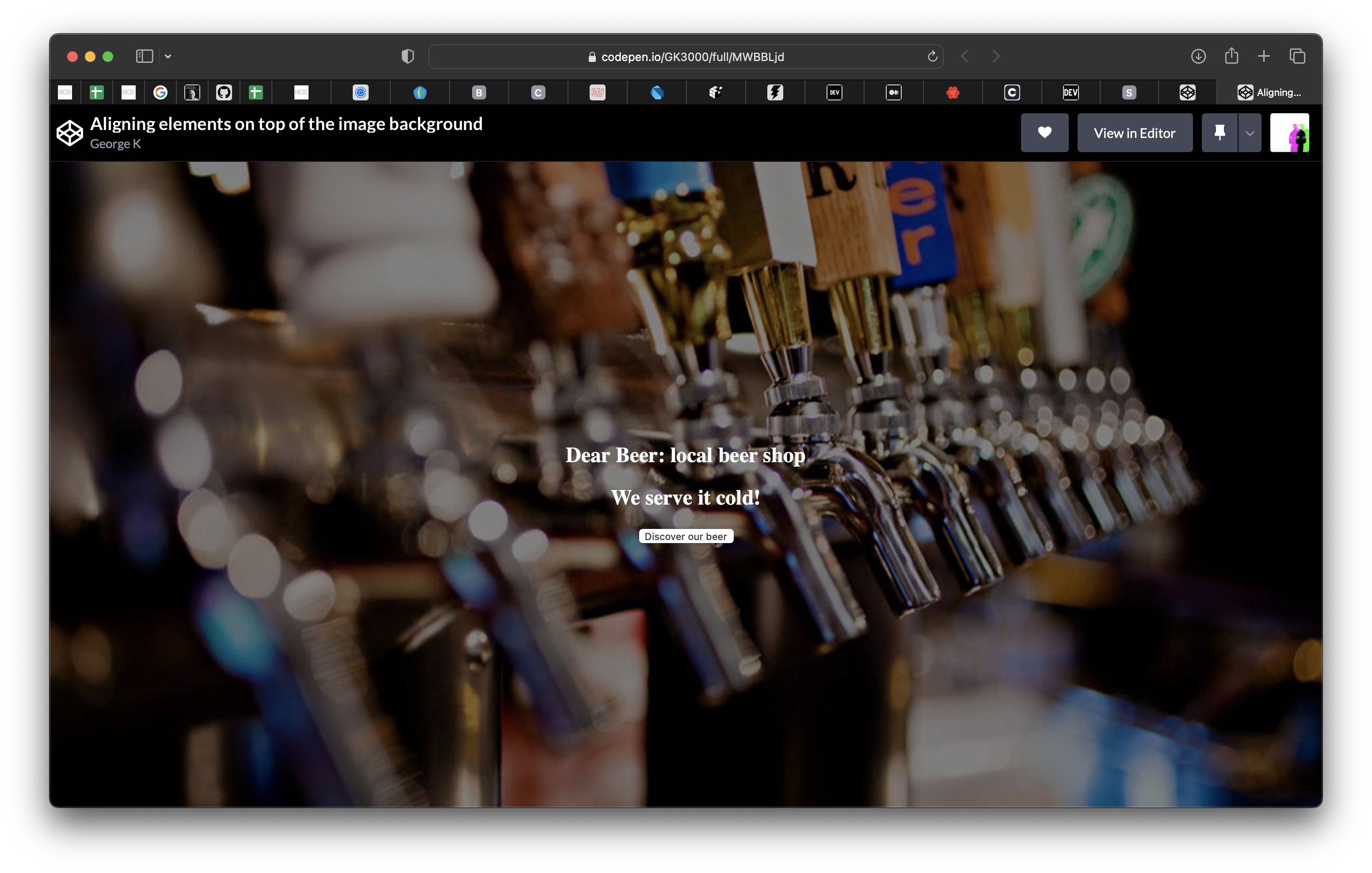
Now if we will resize the browser and change the size of the viewport those elements will all still be right in the center of it!
To remove white spaces around you image remember to get rid of default margins for the
bodycoming from the browser built-in styles:
body {
  margin:0;
}